General Readability and Accessibility
Writing clear, readable emails with focus on readers with visual impairments, dyslexia etc.
Please help edit this page if you have knowledge/guidance on any of these issues.
Text
Using non-serif fonts such as the one here in this document makes text easier to read.
Extinction Rebellion do have official fonts of FUCXED and Crimson, but these aren't necessary for use on an email. Crimson is a 'serif' font - having embelishments on each letter and is therefore less readable for people with dyslexia.
Also avoiding heavy use of italics. Maybe for one word for emphasis but not for whole sentences.
Images
Adding images can sometimes stretch out your email width-ways and make your text appear really small (especially on a phone). You can fix these problems with the advice below...
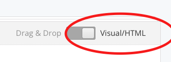
Using 'Visual/html' method
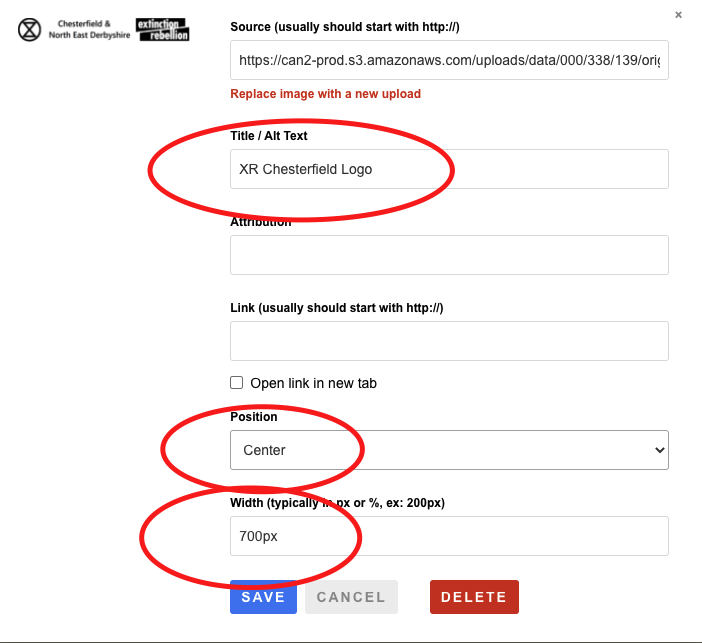
To set the alt tag and the size of an image, click on the image within your email and edit these options...

Using 'Drag & Drop' method
Then make sure you use an image container box and put your image in there. Don't copy/paste images into text boxes. Again there are options for alt text and layout available.


