Optimal layout tips for phones
This advice is based on a single call to action email. When you are sending out an email with the clear purpose to invite the reader to...
- attend and event
- donate to a fundraiser
- lead them to an Action Network form to do a survey or other reason
- to lead them to a webpage with more detailed content
Basically the main mission for the email is to make them understand the topic/event/requirement in a few words as possible and then click through to something else.
Here is an example of an email list this..
First draft looked like this...
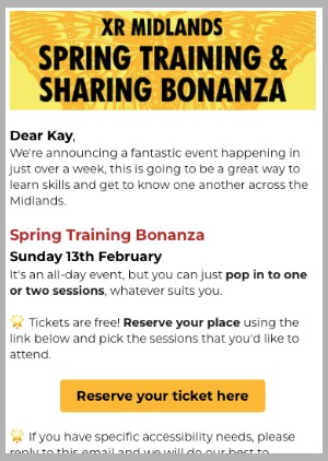
But the 'call to action' button is not visible on a phone without scrolling.
So after making a few edits including reducing a few font sizes, removing a gap between 1st and second line, shortening the main title in red so it didn't wrap. Reducing the height of the image and also adding to bold text to allow the skim reader to go from image to bold text to button and still understand what they are clicking on...
Final verson was this


