
Making Documents Accessible
 Alt text: 1. Use styles to identify headings
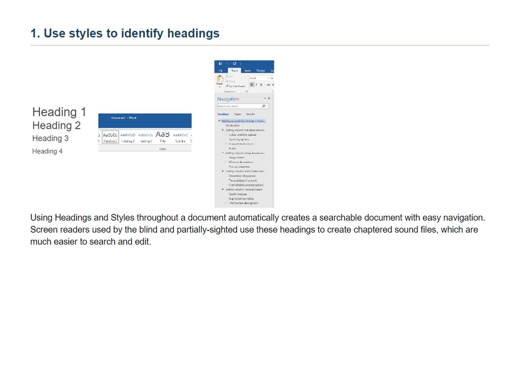
Using heading and styles throughout a document automatically creates a searchable document with easy navigation. Screen readers used by the Blind and partially-sighted use these headings to create chaptered sound files, which are much easier to search and edit.
 [
[
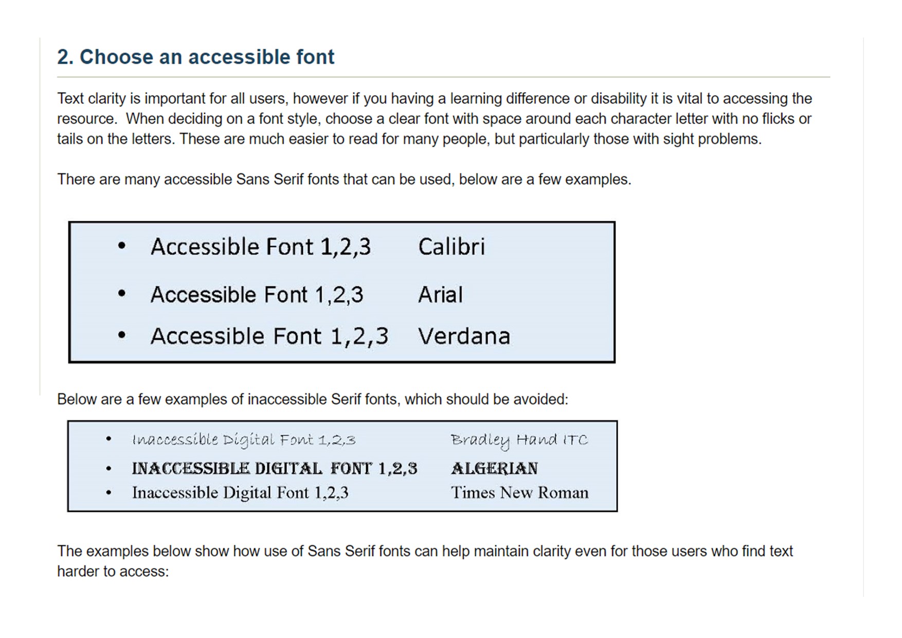
Alt text: 2. Choose an accessible font.
Text clarity is important for all users. However, if you have a learning difficulty or disability it is vital to accessing the resource. When deciding on a fint style, choose a clear font with space around each character letter with no flicks or tails on the letters. These are much easier to read for many people, but particularly those with sight problems.
There are mant accessible sans serif fonts that can be used. Below are a few examples: Calibri, Arial, Verdana.
Below are a few examples of inaccessible serif fonts which should be avoided: Bradlet Hand ITC, Algerian, Times New Roman.
 ](https://rebeltoolkit.extinctionrebellion.uk/uploads/images/gallery/2022-08/Making-documents-accessible-pg3.jpg)
[
](https://rebeltoolkit.extinctionrebellion.uk/uploads/images/gallery/2022-08/Making-documents-accessible-pg3.jpg)
[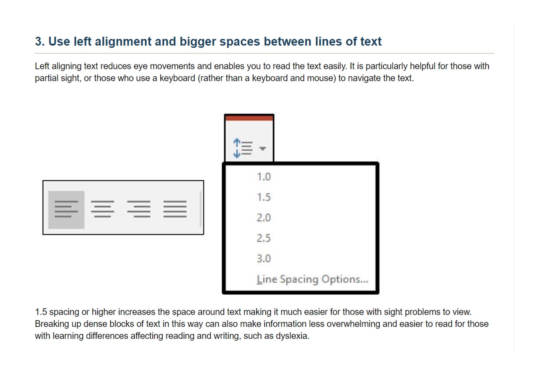 Alt text: 3. Use left alignment and bigger spaces between lines of text.
Left aligning text reduces eye movements and enables you to read the text easily. It is particularly helpful for those with partial sight or those who use a keyboard (rather than a keyboard and mouse) to navigate the text.
1.5 spacing or higher increases the space around text, making it much easier for those with sight problems to view. Breaking up dense blocks of text in this way can also make information less overwhelming and easier to read for those with learning differences affecting reading and writing, such as dyslexia.
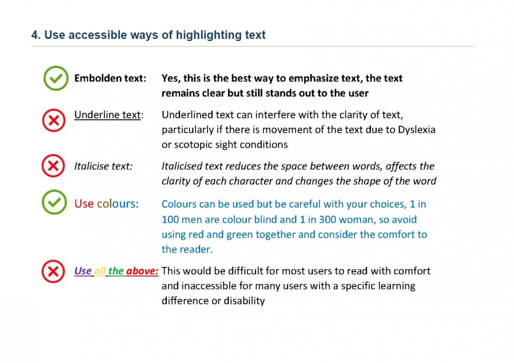
Alt text: 4. Use accessible ways of highlighting text.
Embolden text: Yes, this is the best way to empathize text. The text remains clear but still stands out to the user.
Underline text: Underlined text can interfere with the clarity of the text, particularly if there is a movement of the text due to dyslexia or scotopic sight conditions.
Italicise text: Italicised text reduces the space between words, affects the clarity of each character, and changes the shape of the words.
Use of colours: Colours can be use but be careful with your choices. Avoid using red and green together.
Use of all of the above: This would be difficult for most users to read with comfort and is inaccessible for many users with a specific learning difficulty or disability.
Dyslexia Friendly Style Guide
Written and compiled by Nicki - External Coordinator Disabled Rebels Network
If you're producing a written document with fancy backgrounds and tonnes of images, it's good practise to link a plain text version near the beginning of the document for visually impaired and dyslexic rebels.
Readable fonts
- Use sans serif fonts, such as Arial, as letters can appear less crowded.
- Alternatives include Verdana, Tahoma, Century Gothic, Trebuchet, Calibri, Open Sans.
- Font size should be 12-14 point or equivalent (e.g. 1-1.2em / 16-19 px). Some dyslexic readers may request a larger font.
- Larger inter-letter / character spacing (sometimes called tracking) improves readability, ideally around 35% of the average letter width. If letter spacing is excessive it can reduce readability.
- Inter-word spacing should be at least 3.5 times the inter-letter spacing.
- Larger line spacing improves readability and should be proportional to inter-word spacing; 1.5/150% is preferable.
- Avoid underlining and italics as this can make the text appear to run together and cause crowding. Use bold for emphasis.
- Avoid text in uppercase/capital letters and small caps, which can be less familiar to the reader and harder to read.
Headings and structure
Use headings and styles to create consistent structure to help people navigate through your content. In Word, you’ll find these tools in the ‘Home’ tab:
Headings
- Use a font size that is at least 20% larger than the normal text. If further emphasis is required, then use bold.
- Use formatting tools for text alignment, justification, indents, lists, line and paragraph spacing to support assistive technology users. In Word, you’ll find these tools in the ‘Layout’ tab:
- Add extra space around headings and between paragraphs.
- Ensure hyperlinks look different from headings and normal text
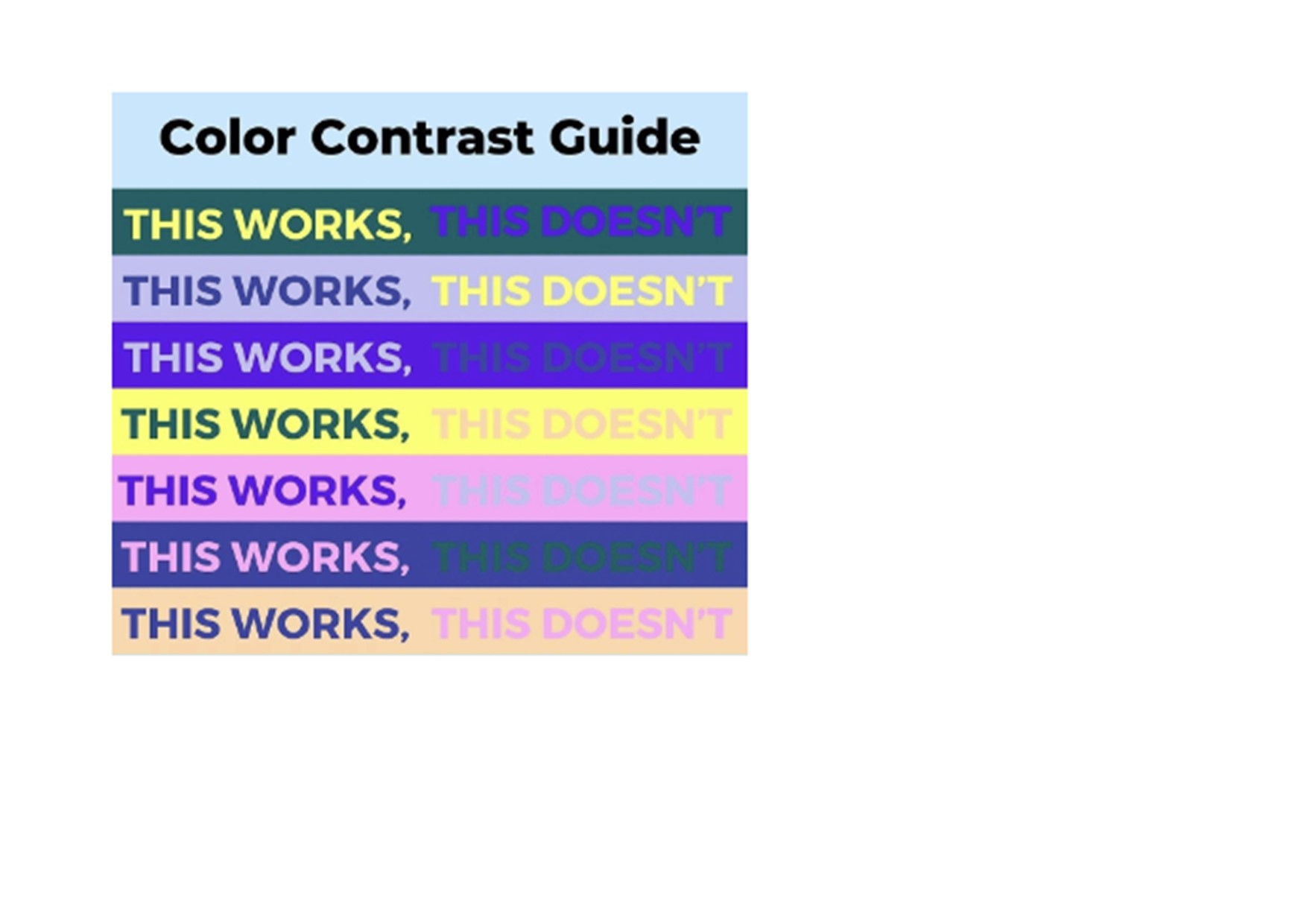
Colour
- Use single colour backgrounds. Avoid background patterns or pictures and distracting surrounds.
- Use sufficient contrast levels between background and text.
- Use dark coloured text on a light (not white) background.
- Avoid green and red/pink, as these colours are difficult for those who have colour vision deficiencies (colour blindness).
- Consider alternatives to white backgrounds for paper, computer and visual aids such as whiteboards. White can appear too dazzling. Use cream or a soft pastel colour. Some dyslexic people will have their own colour preference.
- When printing, use matt paper rather than gloss. Paper should be thick enough to prevent the other side showing through.

Layout
- Left align text, without justification.
- Avoid multiple columns (as used in newspapers).
- Lines should not be too long: 60 to 70 characters.
- Use white space to remove clutter near text and group related content.
- Break up the text with regular section headings in long documents and include a table of contents.
Writing Style
- Use active rather than passive voice.
- Be concise; avoid using long, dense paragraphs.
- Use short, simple sentences in a direct style.
- Use images to support text. Flow charts are ideal for explaining procedures. Pictograms and graphics can help to locate and support information in the text.
- Consider using bullet points and numbering rather than continuous prose.
- Give instructions clearly.
- Avoid double negatives.
- Avoid abbreviations where possible; always provide the expanded form when first used.
- Provide a glossary of abbreviations and jargon.
No comments to display
No comments to display